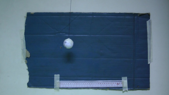
in this activity our group (Ariel Canete, Jessica Nasayao, and Jeremy Hilado) decided to measure the period of a pendulum hanging on a string measuring 90cm. different ROI’s taken from different frames were converted into 2D histograms that were combined and used to segment the pendulum. the following are the ROI’s used for the experiment, and the combined 2D histogram:
the frames used for processing were taken 10 frames apart from the original video.
after isolating the pendulum, and performing morphological operations, the following .gif file was made, showing the segmented pendulum:
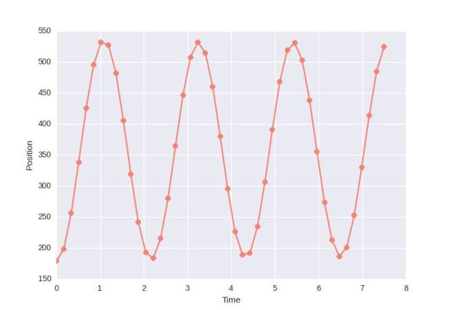
getting the x-centroid (from using the function regionprops) of the ball for each frame resulted to this graph:
the graph show that the period of the ball lasted 2.1 s. comparing that to the calculated period of the ball [T = 2pi*sqrt(L/g)], which is 1.9 s, the percent error was at 10%.
in this activity we were tasked to perform image segmentation on images. image segmentation is used to isolate relevant parts of an image, parts that are needed to be extracted for useful information.
the first task is to segment the letters of a grayscale image shown below:
a histogram was made, showing the pixel number vs the intensity value. it shows how frequent a particular pixel value comes up inside an image.
judging from this histogram one can deduce that the relevant pixels have intensities between 160 and 210. i used two thresholds, 160 and 180, to eliminate pixels below 160, and also pixels above 180. the resulting image is shown below.
then we were talked to isolate objects from an RGB image. there are two kinds of segmentation based on color: parametric, and non-parametric segmentation. parametric segmentation extracts objects that fall under a certain probability, which is determined by an extracted cropped template. the product of the probabilities in red and green space (blue is not necessary, since it is just a linear combination of red and green) is the joint probability. if a pixel falls into that joint probability, then it is considered more or less the same color.
below is a frame from a UAAP basketball game between Far Eastern University and De La Salle University.
a patch was extracted from a green-jerseyed player (see blue square above), and a patch was extracted, shown below:
and below are shown the resulting mask, and the extracted objects from the original image.
non-parametric segmentation on the other hand requires one to make a 2D-histogram, which shows the position of the color values in an r-g space. if the value of the pixel falls inside that position, then it can be considered the same color.
below is the histogram used:
and below are the mask, and the extracted objects.
in this activity we were tasked to perform morphological operations. morphological operations affect the shape of a binary object, whether to enlarge it, or eliminate it, or to combine two blobs together, or whatever task needed. this is important, since it can be used to clear out any noise in a signal, or to enhance the information that is needed to be extracted.
to perform a morphological operation one needs a binary image, containing the object/s to be modified, and a structuring element, which would determine the shape of the modification. there are two main types of morphological operation: erosion and dilation. the former chips off parts of the object, while the latter expands it.
the binary objects used were:
a 5 x 5 square
a triangle, with base = 4 px, height = 3 px
a hollow 10 x 10 square. 2 boxes thick
a plus sign
and the structuring elements used were:
2 x 2 ones matrix
2 x 1 ones matrix
1 x 2 ones matrix
3 px-wide cross
a diagonal line, 2 px long
below are the results of the morphological operations. the lower left corresponds to the dilation, while the lower right corresponds to the erosion.
to expand on morphological operations, we were tasked to determine the area of the circles shown below:
this would require isolating the circles using image segmentation, after which morphological operations can now be used.
three new morphological operations are introduced: Open, Close, and TopHat. the Open operator is a combination of the erosion and dilation operations. the object is eroded first, and then dilated. it opens the gaps between two connected blobs, and eliminates objects smaller than the structuring element. the Close operator dilates, and then erodes the object. this closes the gaps between two objects, and can be used to coagulate many objects with potentially the same characteristics. TopHat is basically the difference between the opening of the image and the original image.
the original image was split into 12 equally sized sub-images (256 x 256) in order to have many samples for the determination of the area of the circle.
the morphological operation used here was the Open operator, to eliminate the noise the might result from the thresholding. after performing the opening, the blobs are then labeled and the areas of each individual blob were determined. this was done by using the MATLAB function regionprops.
the area was found to be around 572 px, with standard deviation of 258 px.
one can then used this information to determine abnormally large cells (cancer cells) in an image. below is an image of normal cells wixed together with cancer cells.
using the Open operator, and by isolating the normal cells using the MATLAB function bwareaopen, i was able to extract the normal cells:
as well as the cancer cells (green = normal cells; purple = cancer cells)
when one performs an FFT on a 2D signal, sometimes the axis of the signal on the spatial frequency plane would be shifted 90 degrees from the original axis of the input signal. what may be wide in the spatial plane may be narrow in the frequency plane. this is known as anamorphism. here are some figures that illustrate this phenomenon.
This slideshow requires JavaScript.
the next few slideshows demonstrate the FFT’s of different sinusoidal patterns. this one shows the FFT of sinusoidal patterns with different frequencies. the larger the frequency of the sine pattern, the larger the gap between the two dots in the frequency plane.
This slideshow requires JavaScript.
below is the effect of putting a bias on a sinusoidal pattern. the larger the bias, the more prominent the intensity of the center dot, and the less prominent the two dots on either side of the center.
This slideshow requires JavaScript.
this slideshow shows the FFT of rotated sine patterns. notice that the resulting FFT pattern is always shifted 90 degrees from the original sine pattern.
This slideshow requires JavaScript.
this slideshow shows the FFT of the addition of two sinusiodal patterns in different axes, with different frequencies.
This slideshow requires JavaScript.
this slideshow illustrate the FFT of the multiplication of two sine patterns with same frequencies, but with varying phase differences.
This slideshow requires JavaScript.
the next 6 slideshows display the FFT’s of the following:
two dots with different gap distances
two circles with different radii
two squares with different sizes
two gaussian shapes with different variances
random dirac deltas convolved with different patterns
equally spaced dirac deltas with increasing gap size
This slideshow requires JavaScript.
This slideshow requires JavaScript.
This slideshow requires JavaScript.
This slideshow requires JavaScript.
This slideshow requires JavaScript.
This slideshow requires JavaScript.
the following figures show how to remove the lines in a photograph of the lunar surface (1). first the image was converted to grayscale, and its FFT was generated (2). a filter was made to remove the horizontal and vertical line present in the fourier domain (3), since these lines contribute to the lines in the original image. note that there is a gap in the center of the filter. this is to preserve the information of that original image, which is located in the center of the fourier plane. the FFT and the filter was multiplied, and then shifted back to the spatial domain, resulting to the cleaned image (4).
the following figure used the same technique that was utilized in the previous exercise, except that the filter used was different (3). from the FFT (2) one can see the presence of big dots surrounding the center, which account for the noise present in the original image (1). the final image is found in (4).
in this activity we try to determine how the output would look like if one applies a Fourier Transform on an image. the Fast Fourier Transform is a powerful algorithm that basically recasts a signal into another complex plane showing the image’s spatial frequency.
in the first slideshow, input images (1) were applied with an FFT using fft2(), and the resulting pattern was applied with abs() to get it’s intensity values (2). fftshift() was then applied to show more clearly the intensity plot (3). then from (2) another fft2() was applied to revert back to its original (albeit inverted) form. (to avoid this, one can use ifft().)
This slideshow requires JavaScript.
in the second set of figures, i used convolution to simulate the effect of changing the size of the aperture to the quality of the image. convolution is a method used to combine two signals such that the resulting signal would look similar to both input signals. the primary image used was “VIP”, and the apertures used were of radii from 0.1, 0.2, … , 1.0. the final output reveals that the smaller the aperture, the lesser the quality of the output. higher quality outputs were generated with bigger apertures.
in these set of figures, i used correlation to determine the similarity of a given pattern and the whole image. the pattern is “rolled” across the main image and the amount of correlation is determined. using this technique one could determine more of less the positions of the letter A’s through correlation and thresholding.
the final figure illustrates edge detection using convolution. three sets of patterns were used (left), and these patterns were convolved around the image (previously used in the correlation part). the results show that the edges that were being detected would depend on the pattern used. a horizontal pattern would yield horizontal edges, vertical patterns would lead to vertical edges, and dot patterns would detect all possible edges and corners.
in this activity, i did area estimation techniques using different edge detection methods. i decided to calculate the area of the Quezon Memorial Circle.
so we were tasked to generate synthetic images using Scilab, a high-level programming language that can do image-processing (among other things). i however, used MATLAB (and will be using MATLAB for the rest of the semester and my life), since i’m more used to it, and i have been using it for more than half a year now. still, just because you’ve been using it for a relatively long time, doesn’t mean you’re pretty proficient with it.
anyway, this is a checklist of what images we should be able to generate:
a. centered square aperture
b. sinusoid along the x-direction
c. grating along the x-direction
d. annulus
e. circular aperture with gaussian transparency
f. ellipse
g. cross
and here’s the code:
%%%Hilado Activity 3%%%
saveloc = 'D:\Random Stuff\20150820\AP 186 Act 3\';
saveext = '.png';

%%%set size of image%%%
nx = 150; ny = 150;

%%%create square aperture%%%
x = linspace(-1,1,nx); y = linspace(-1,1,ny);
A = ones(nx, ny);
A(find(abs(X) > 0.4)) = 0;
A(find(abs(Y) > 0.4)) = 0;
figure(1); imshow(A);
imwrite(A, strcat(saveloc, 'square', saveext));

%%%alternative method to creating square aperture%%%
% I = ones(50,50);
% I = padarray(I,[50,50]);
% figure(1); imshow(I);

%%%create sinusoid grid%%%
x = linspace(-10,10,nx); y = sin(x);
[X,Y] = ndgrid(x,y);
figure(2); imshow(Y);
imwrite(Y, strcat(saveloc, 'sinusoid', saveext));

%%%create square grating grid%%%
y = square(x);
[X,Y] = ndgrid(x,y);
figure(3); imshow(Y);
imwrite(Y, strcat(saveloc, 'grating', saveext));

%%%create annulus%%%
x = linspace(-1,1,nx); y = linspace(-1,1,ny);
[X,Y] = ndgrid(x,y);
r = sqrt(X.^2 + Y.^2);
A = zeros(nx, ny);
A(find(r<0.7)) = 1; A(find(r<0.4)) = 0;
figure(4); imshow(A);
imwrite(A, strcat(saveloc, 'annulus', saveext));

%%%create circular aperture with gaussian transparency%%%
sigma = 2.0;
gauss = 1/(2*pi*sigma^2)*exp((-r^2)/(2*sigma^2));
gauss = gauss./sum(gauss(:));
figure(5); imshow(mat2gray(gauss));
imwrite(gauss, strcat(saveloc, 'gaussian', saveext));

%%%create ellipse%%%
a = 1; b = 1.5;
ellipse = (X/a).^2 + (Y/b).^2;
ellipse./sum(ellipse(:));
A = zeros(nx,ny);
A(find(ellipse<0.4)) = 1;
figure(6); imshow(A);
imwrite(A, strcat(saveloc, 'ellipsis', saveext));

%%%create cross%%%
A = zeros(nx,ny);
A(find(abs(X)<0.3)) = 1;
A(find(abs(Y)<0.3)) = 1;
figure(7); imshow(A);
imwrite(A, strcat(saveloc, 'cross', saveext));
you can digitally recreate the plot. all you need is to tabulate the image coordinates of the tick marks of the x- and y-axes, and derive a formula relating physical value to image coordinate value. once you’ve done that, get enough points from the plot itself, and convert their pixel coordinates to their physical coordinates. and voila, you’re done.
of course, this whole paragraph is pretty unintelligible to some, since i just condensed everything in one quick 30-second read. so i’ll be more detailed from now on.
this was deceptively easy.
actually, the activity itself was very doable. the hardest part is finding a hand-drawn plot. and also the realization that you cannot – never, ever – photocopy some journal without the explicit permission of the author. which is tricky, since they are either too busy to be bothered by some puny undergraduate, too old that they are probably drinking tea by the seashore, or that they’re dead.
so i looked at the next best thing: books. i went to the IPL (Instrumentation Physics Laboratory) at the 4th floor, and scrounged the old books lying about. fortunately, i came across this beauty of a plot, which is most likely hand drawn. i mean, what machine can reliably make this in the 80’s?
Figure 2. A plot taken from the paper “Evidence for a Structural Phase Change in the Fast-Ion Conductor Na3Sc2P3O12”
this was scanned with a resolution of 100 dpi.
so the software i used to align and rotate the image was GIMP. lemme show you what it looks like:
Figure 3. A GIMP 2 interface
it’s pretty messy, but lemme show you a quick rundown. the left toolbox is where you’ll find the basic tools you’ll normally find in some other basic image processing program such as Paint, or Photoshop. there’s the crop tool, scale, zoom, pencil, blur, and other nifty stuff. on the right is the layers and brushes toolbox, where you organize your layers and manipulate your brushes. the plot at the center is the plot i scanned. and the small toolbox beside the layers-brushes toolbox is the pointer toolbox. it’s where you’ll know exactly what are the coordinates of some part of the image you’re pointing at. the important part here is that you know the pixel coordinates, encircled below:
Figure 4. Where the pixel coordinates are
note that the origin, or (0, 0) of the image in this case is located at the upper-leftmost corner.
next thing to do is to crop and rotate the image, such that the x- and y-axis of the plot is really horizontal and vertical.
Figure 5. Rotated and cropped
using gimp, locate the tick marks on the axes, and note their pixel coordinates. just point your mouse onto your marks, and the pointer toolbox will show you the corresponding x and y pixel coordinates. and then you tabulate them on Excel.
Figure 6. My messy Excel workbook
i’m pretty sure most of us know how to make a graph and construct a trend line on excel, since this is basic stuff. so, yes, basically, you find an equation relating the pixel location to the plot coordinates. you can see the equations in the two graphs on the image, as examples.
then what’s left to do is collect points from the plot itself, and convert their pixel locations to physical coordinates, using the equations you have derived. and this should appear:
Figure 7. Reconstructed plot, overlaying the original plot
as one can clearly see, the reconstructed plot fits neatly into the original plot. and that’s a job well done.
oh, by the way, how did i make an overlay image on the background of my Excel graph? simply right-click on the plot area, click “Format Plot Area”, and then you’ll see this:
Figure 8. Format Plot Area
you should select “Picture or texture fill”, and browse for your desired image (or in this case, the original plot). and then adjust the image through fiddling with the “offsets” in “Stretch Options” until you fit the image perfectly.
i am inclined to give myself 11/10 because i did everything in the activity, and also i managed to overlay an image into the spreadsheet.
Source of plot: Delbecq, C. J., Marshall, S. A., & Susman, S. (1980). Evidence for a structural phase change in the fast-ion conductor Na 3 Sc 2 P 3 O 12. Solid State Ionics,1(1), 145-149.
unfortunately, for those who were looking for thomas mueller and was hoping for a fan-made blog about his unorthodox yet strangely beautiful darts across and through a bamboozled back line and his array of seemingly ordinary goals, you will be disappointed. (though if you do know where to find them, please please please do tell me.) what this website is is a series of posts detailing the activities of an undergraduate physics student – specifically, those related to image and video processing. there are others just like this made by my classmates, and i have tremendous respect for them, especially those who get really high grades without even trying. the purpose of this blog is to show that we (me and my classmates) are indeed capable of doing such work, and to help other people find their way in case they get lost in all the technicals. the blog also aims to show that doing all these is also fun. hence, the entries posted here will be as vibrant and engaging as possible, and all technical stuff (codes, graphs, you name it) will be infused with human emotions and feelings, if at all possible. here’s a sample of what might be written here:
%%%initializing zero matrix with nervous breathing%%%
size = 100; %just because
A = zeros(size, size);
%%%end initialization and initialize raucous applause%%%
you get the idea.
anyway, if you are even remotely interested in programming and/or seeing a student fumble, then you’ve come to the right place. i hope you can take something from my posts. criticism is highly encouraged. i’m happy to be told when i’m doing something wrong, or if there is a better way of doing things. toodles!
Jeremy Hilado
p. s. you will see a self-rated score at the bottom of each post. this is not a way for me to display my narcissistic side, but is a requirement to show that we are capable of objective self-evaluation.